Explore the mall like a VIP
Redesigning how customers visit Simon Malls
I lead the design of the current Simon Mall mobile app for both iOS and Android. I worked on this project when I worked for Studio Science as a Product Designer.
A few highlights from my time in this role include:
- Created a new onboarding flow to increase VIP signups
- Designed a reimagined, extensible design system that pushed the brand's visual style to new heights
- Created a visually stunning onboarding flow that simplified finding a store
Here's the work I did to bring this project to life for Simon
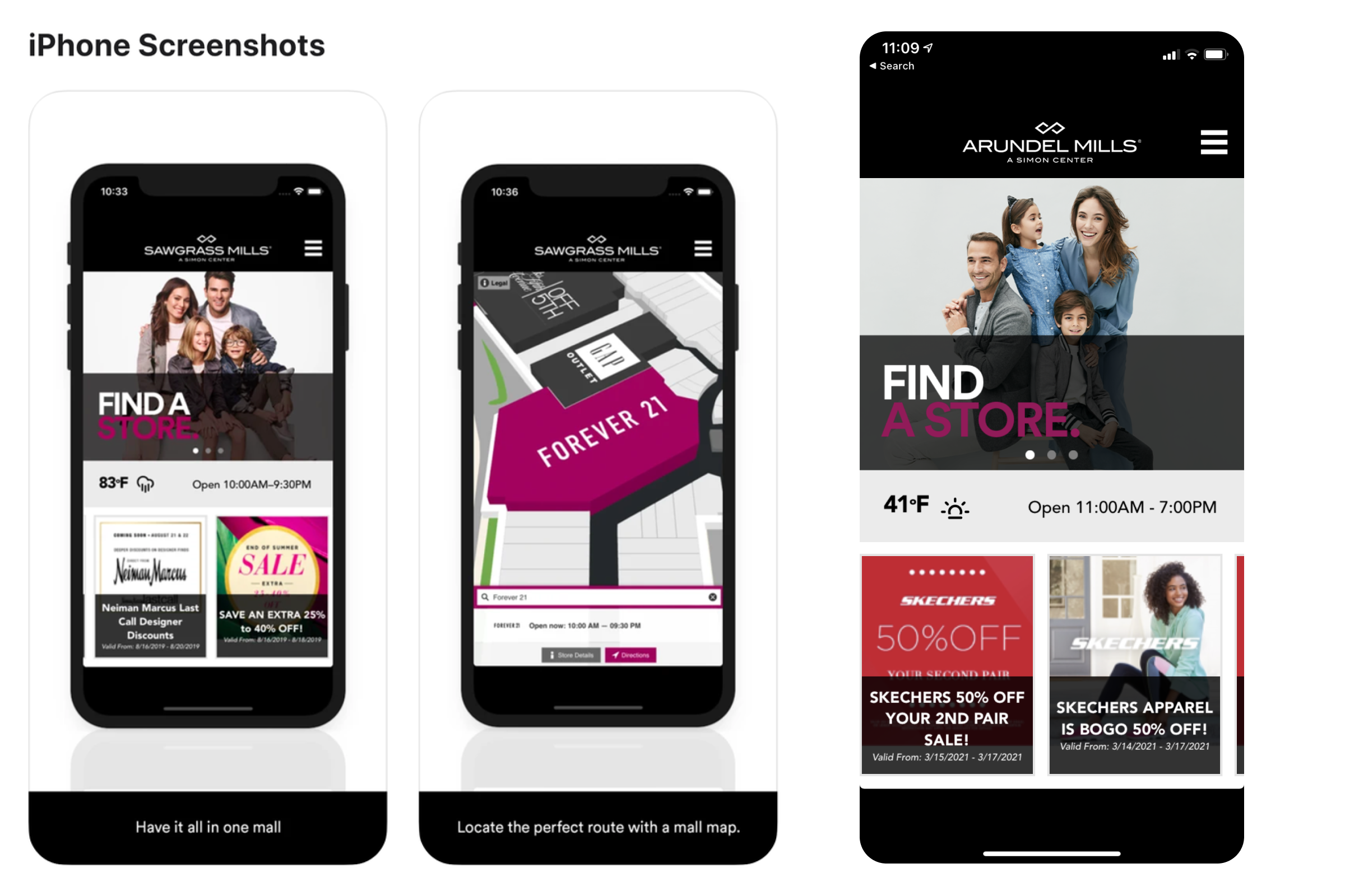
To get started, we explored the existing mobile app (left) and the mobile web experience (right). The mobile app was outdated, meaning that the most up-to-date experience was the mobile web app.
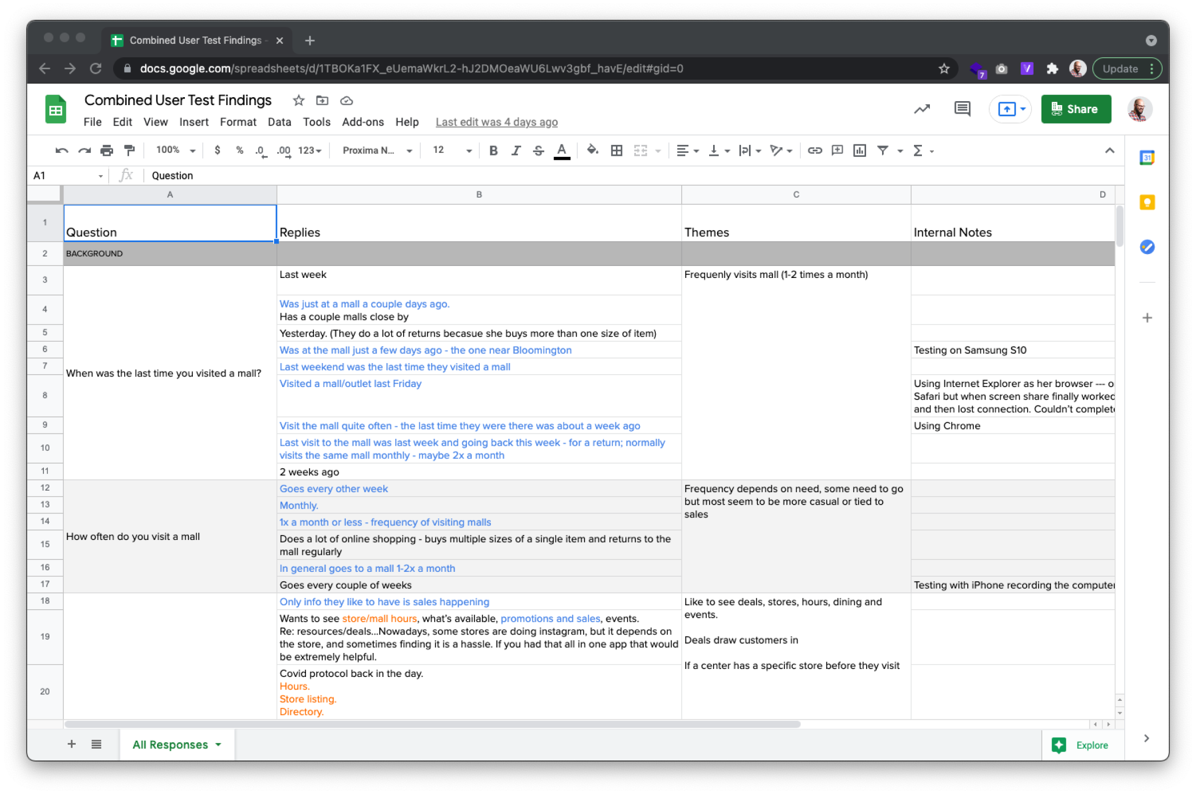
Before we set out to build or design anything, we met with customers that already visit Simon Malls around the country. We had a research team member draft questions, and I interviewed the customers and synthesized the data we collected to inform the next stages of the project.
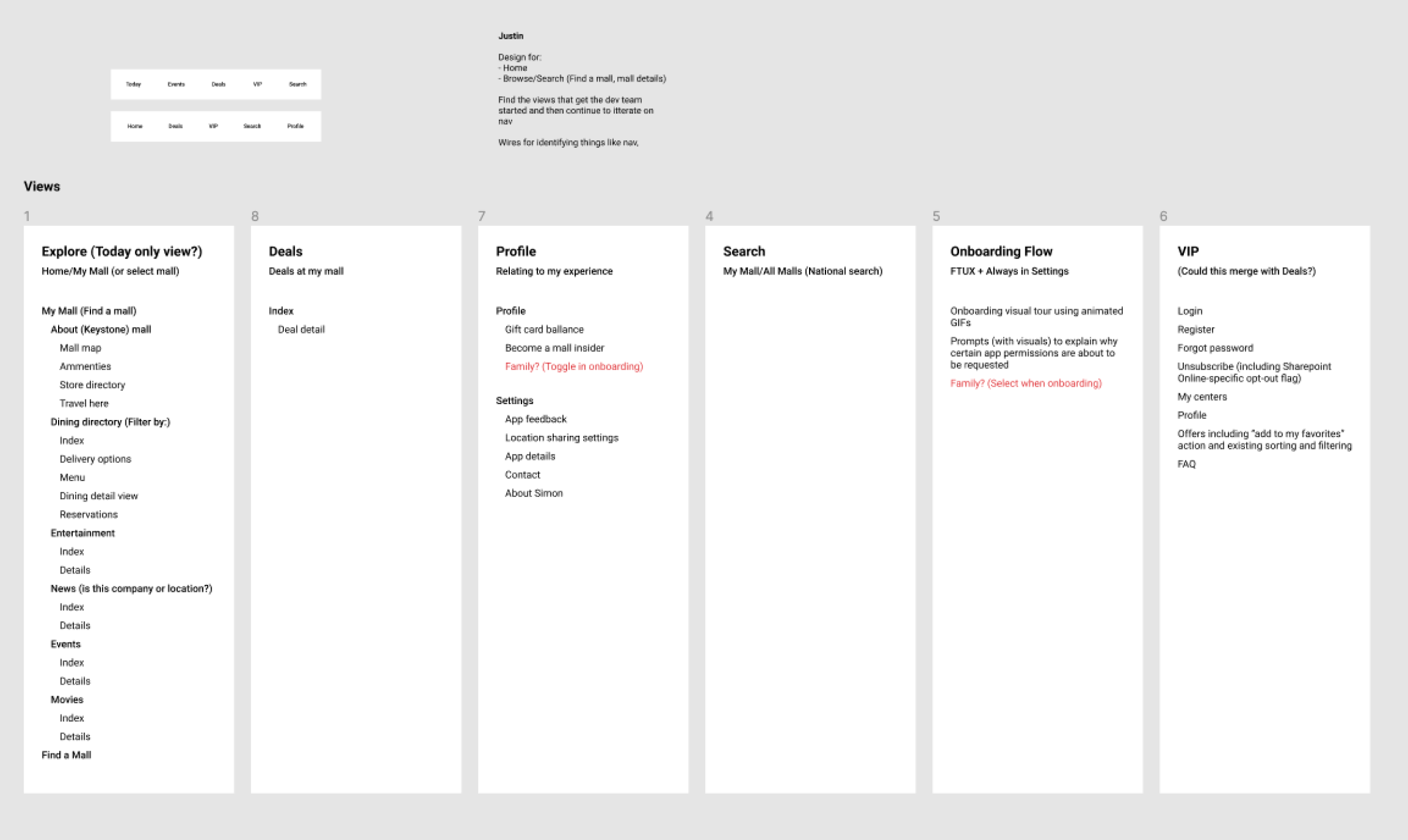
The goal of this project was to create a new mobile app built in react. That meant that we were planning to pull in all of the content from the mobile website into the new app. The flexibility of building a native mobile app meant that we could explore placing content in new buckets to make it easier for customers to interact with.
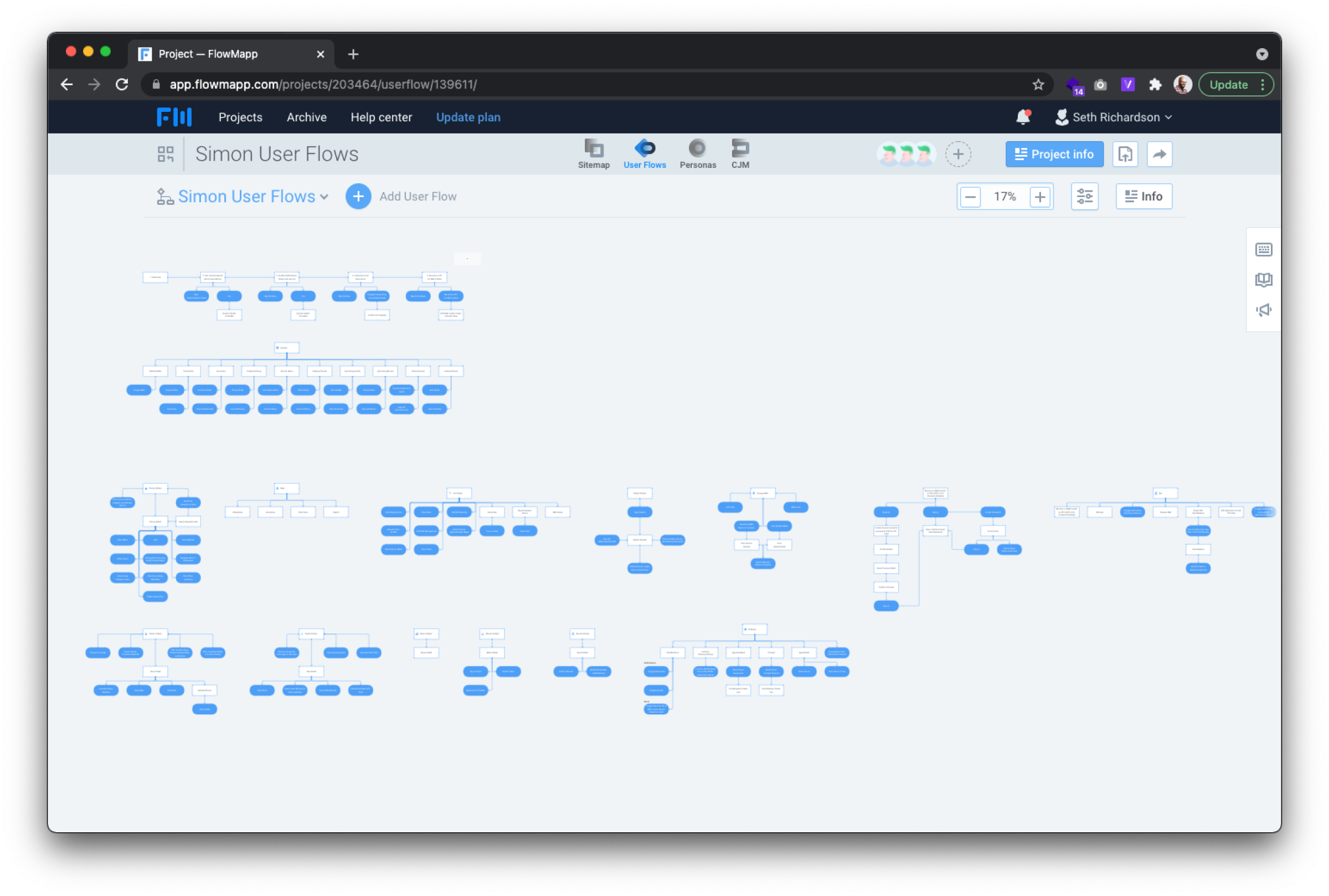
Once we completed a pass at the new navigation, we had it approved by the Simon team. Our team consisted of a Project Manager, a Director of Product Design, and myself, the Product Designer. We proposed this new way of structuring the nav and built out a series of flows that identified where how the new nav would impact where important content lives.
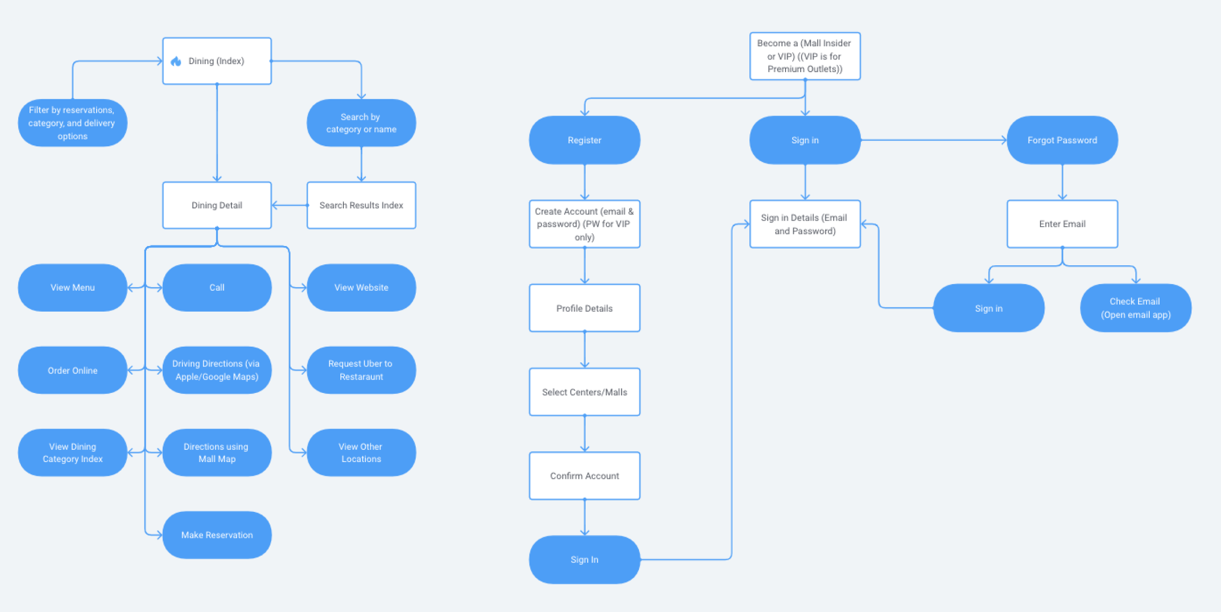
Here's a zoomed-in look at the initial flows for dining and joining the VIP program.
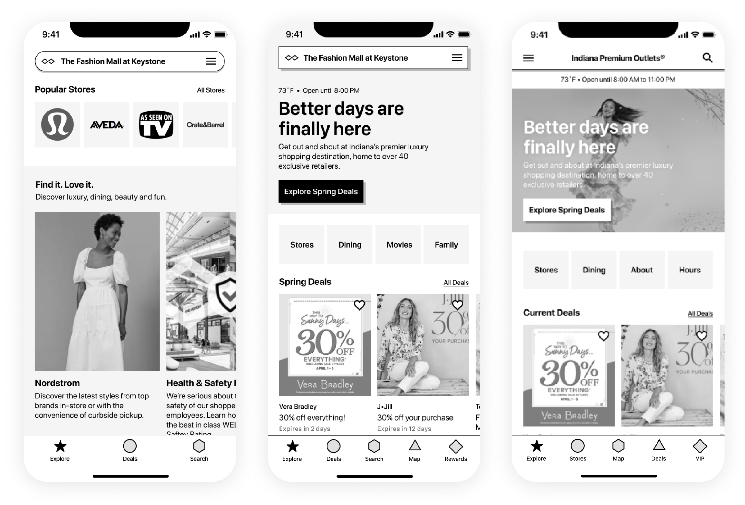
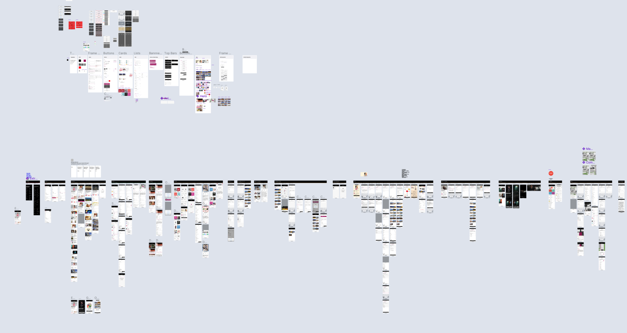
With the navigation set, I explored how we could lay out the navigation patterns in a visual way with wireframes. In this example, you can see how I explored different bottom navigation treatments, different content layouts, and priorities, and explored general functionality like the ability to save deals by liking them. I met with some of the same customers we initially talked with to review wireframe prototypes, and validate the flow and placement of content they needed. The feedback they provided impacted the HiFi solution.
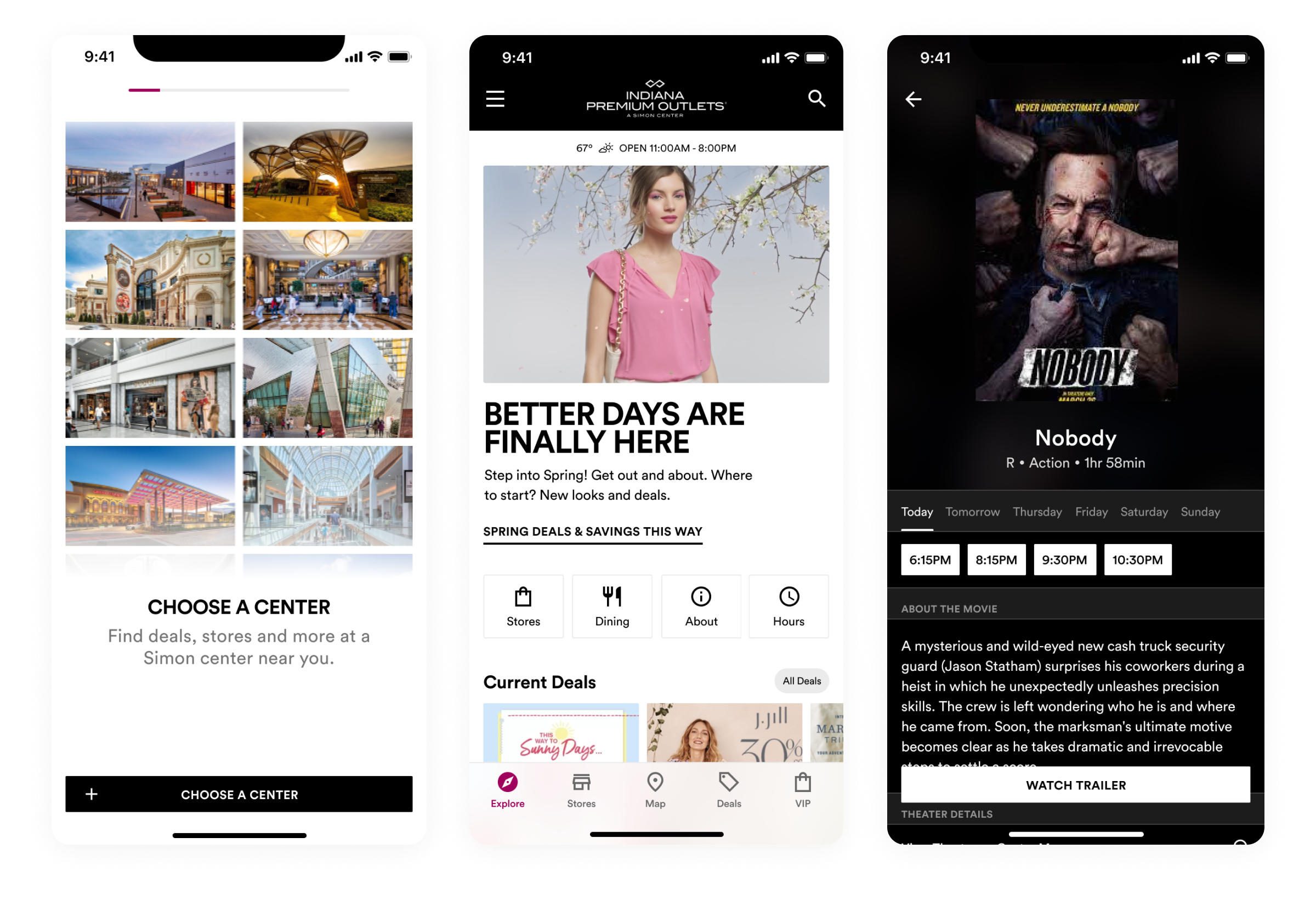
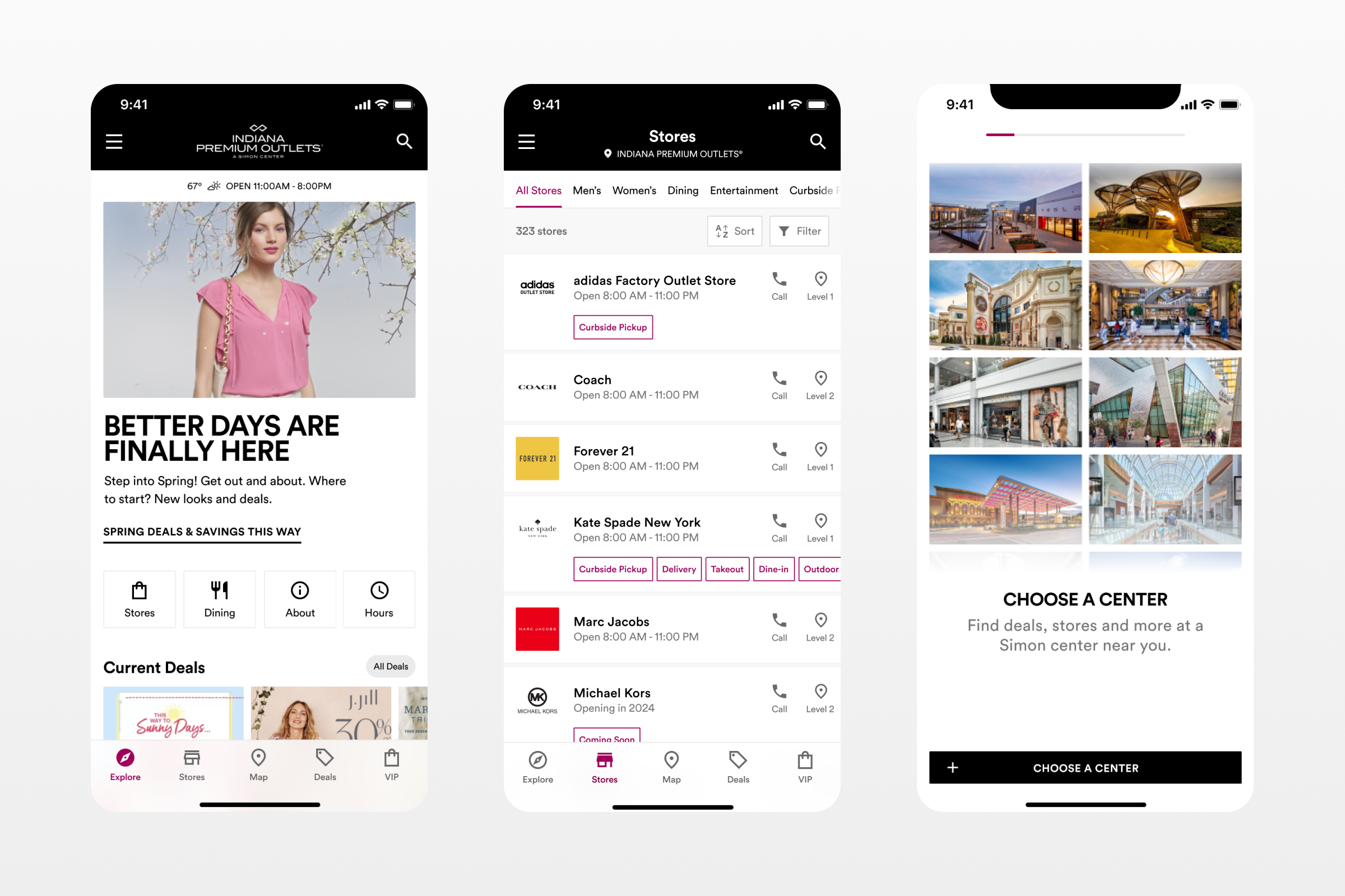
Moving to HiFi meant I could finally explore how to apply their brand to the new mobile experience. Here I was able to use the wonderful on-site photography Simon had taken of their malls over the years to create a unique onboarding experience, combine that with the imagery they use to advertise various brands and seasons for the homepage, and even explore a dark-themed theater experience for exploring movies showing at your local center.
Impact:
- Helped Simon answer "why" customers like using the app, and use that feedback to improve the experience to convert more customers to use the app
- Improved the App Store rating from 3.5 stars to 4.9
- Refreshed and extended Simon’s digital design language
- Internally the project is seen as a major success and the partnership with Studio Science
Check out the app on the App Store or Play Store.
