Creating a powerfully simple checkout experience for fiber internet

Glofiber is a fiber internet service provider based in the Shenandoah Valley in Virginia. They hired Studio Science to create a website and e-commerce experience to enable customers to purchase internet services online. The existing business model for purchasing internet service was resource-heavy, requiring dedicated team members to answer phone calls, emails, and letters, and coordinate home visits. We created an experience that enabled customers to purchase and plan home visits, cutting down on resources required to onboard a new customer.
As the Product Designer leading the end-to-end design work for the checkout experience. Here are the things I did to bring this checkout experience to life for Glofiber:
- Create a no-code lead capture website to collect customer signups
- Interviewed potential customers. A dedicated research team member created the questions that I used to interview customers
- Created a customer journey map identifying the steps a customer would need to take to get the services installed in their home
- Informed by research and the journey map, I created wireframes with each of the actions in mind and tested them with customers
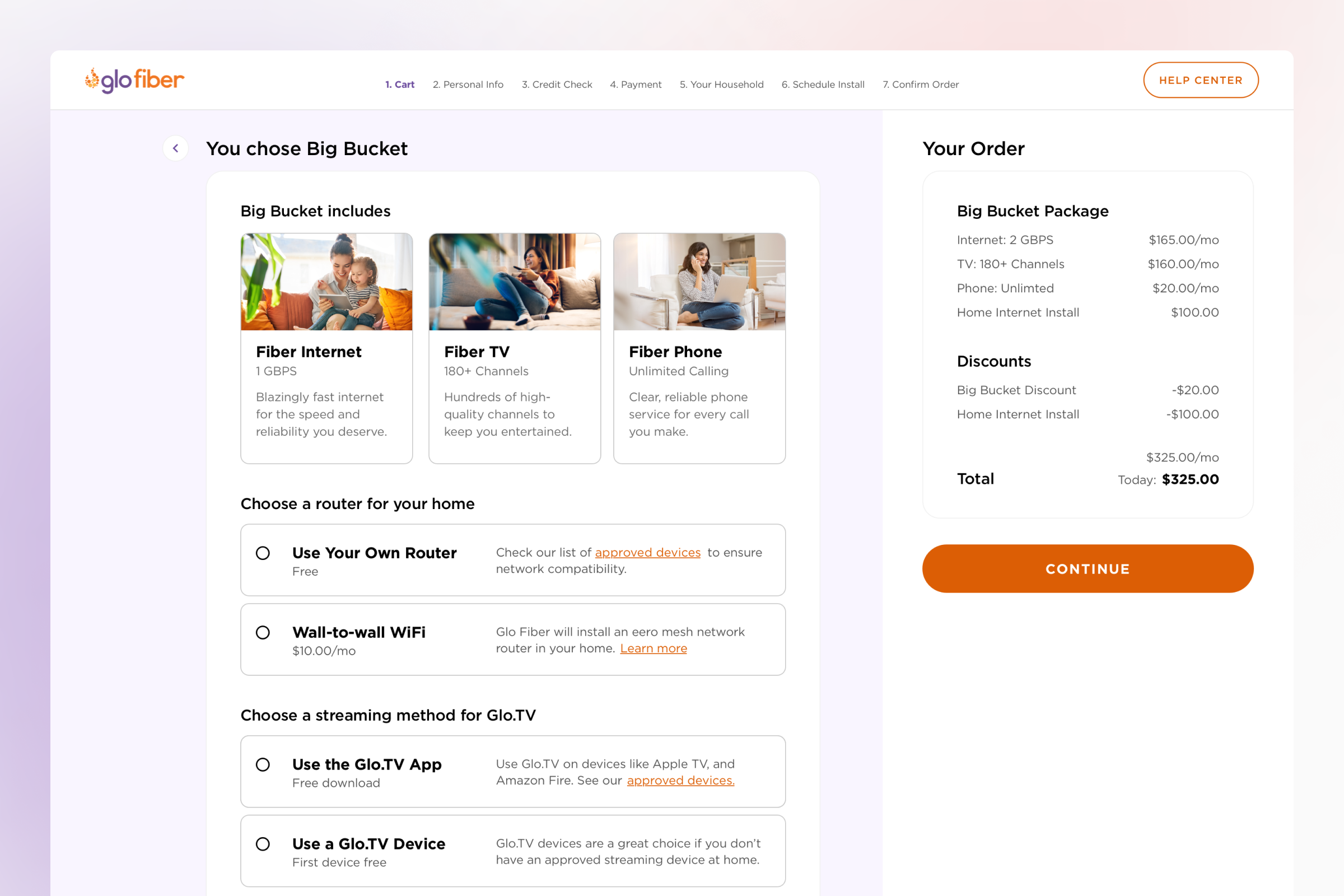
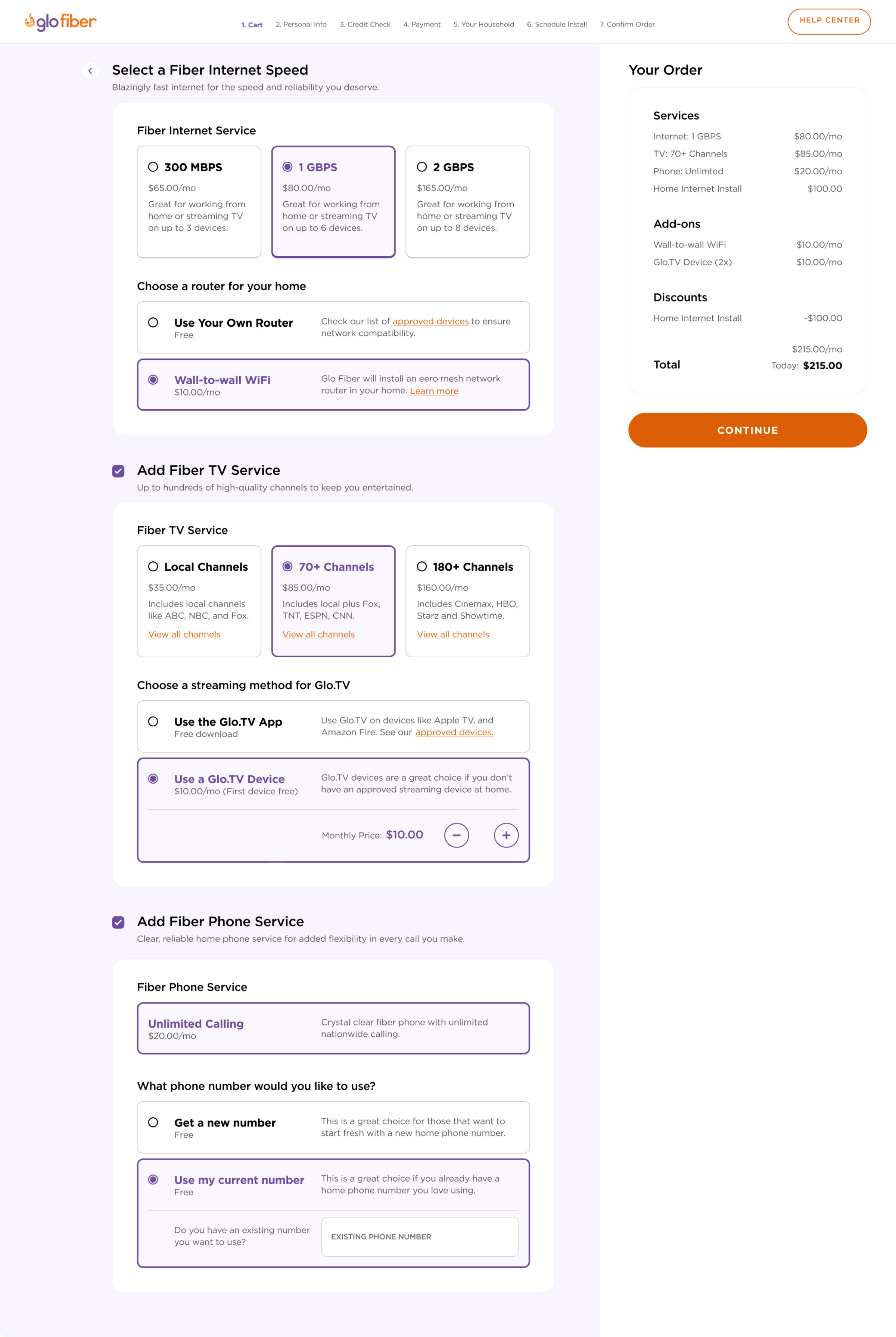
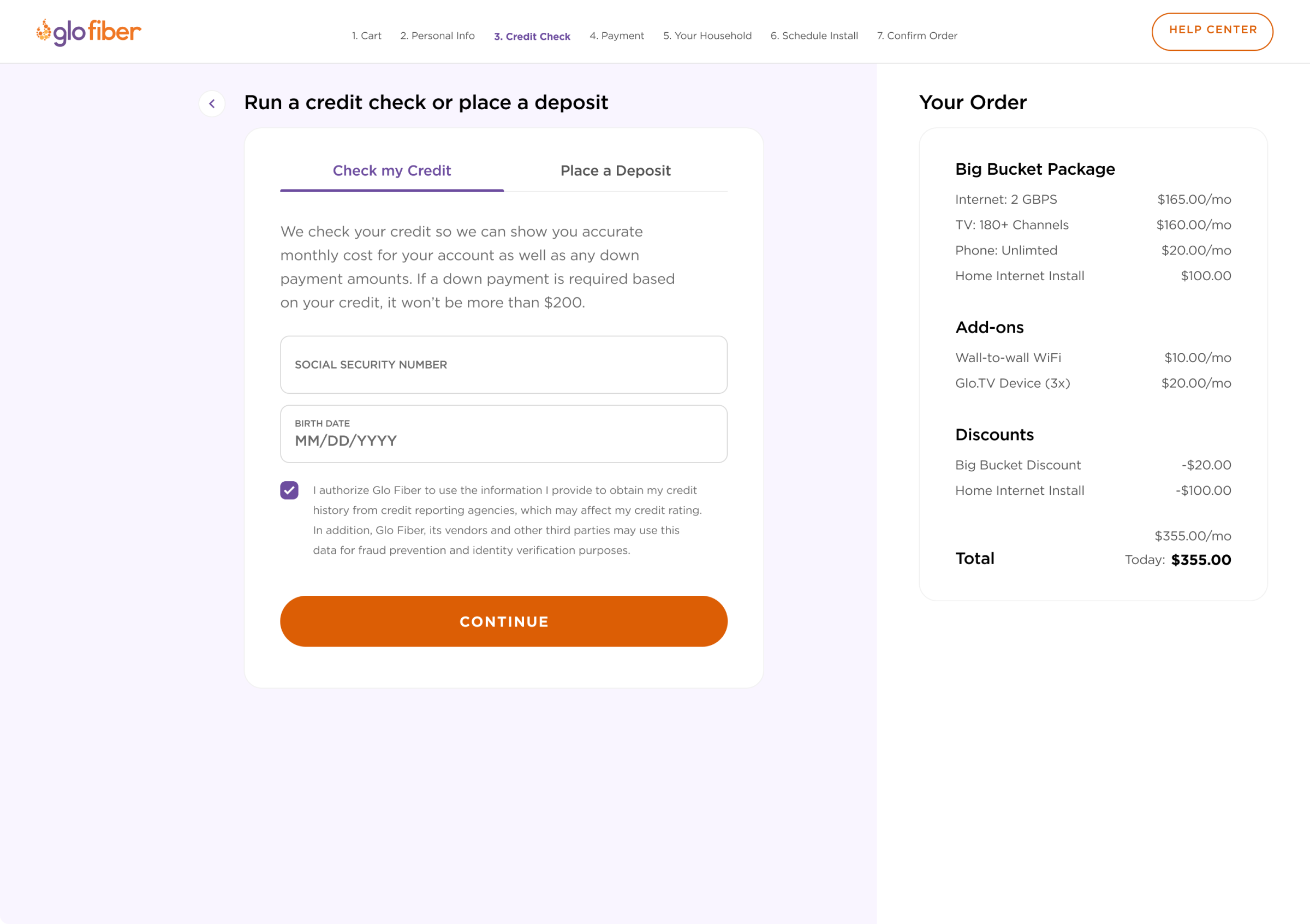
- Once confirmed that we had a well-built experience, I used the Glofiber brand to inform how the high-fidelity version of this experience would look like.
- Documented important design details for handoff to the development team.
Here are some screenshots of the work as it was handed off to the customer. (I know "hand-off" is a touchy subject. Agencies often create artifacts for customers to implement independently. Some customers purchase additional implementation support, but in this case, Glofiber did not.)

