Android Auto Design Review
Deep Dive: Anroid Auto
Android Auto is the best driving app you've never heard of. Android Auto first debuted in May 2019 at Google's I/O Developer conference as a stopgap app until the real mobile device driving experience shows up as a part of Google Assistant. Thankfully, that day has not come so we can all download and experience an excellent driving app.
🖤 Chunky UI
The very first thing you notice when you start open Auto is just how much chunkier the interface is compared to standard Android experience, this is a much more chunky interface. Every part of the home screen grows in size from the icons in the status bar to the on-screen navigation buttons. You truly start to appreciate the chunky scale of the UI once you start using the app when you are driving.
Navigation
The other cool feature is that the on-screen navigation buttons that you are used to almost merge with the toolbar above on the standard interface. Now you have just one button for home, and a small grouping for things like calls, maps, and audio. I love this change because it helps add a level of focus to the app that wouldn't be available if the standard navigation patterns existed. The other reason I love this is that I can't think of another app that completely changes the way you navigate from screen to screen.
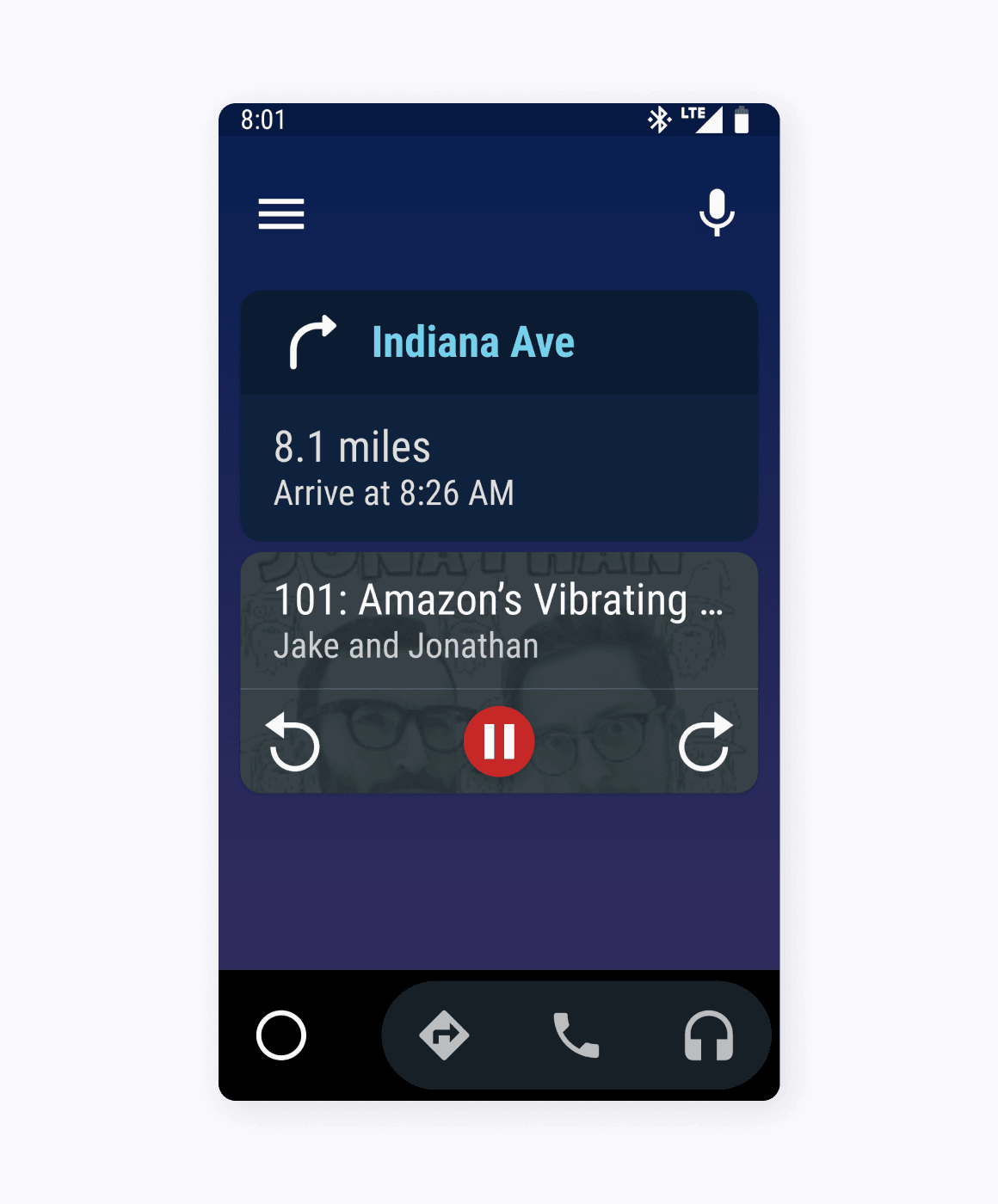
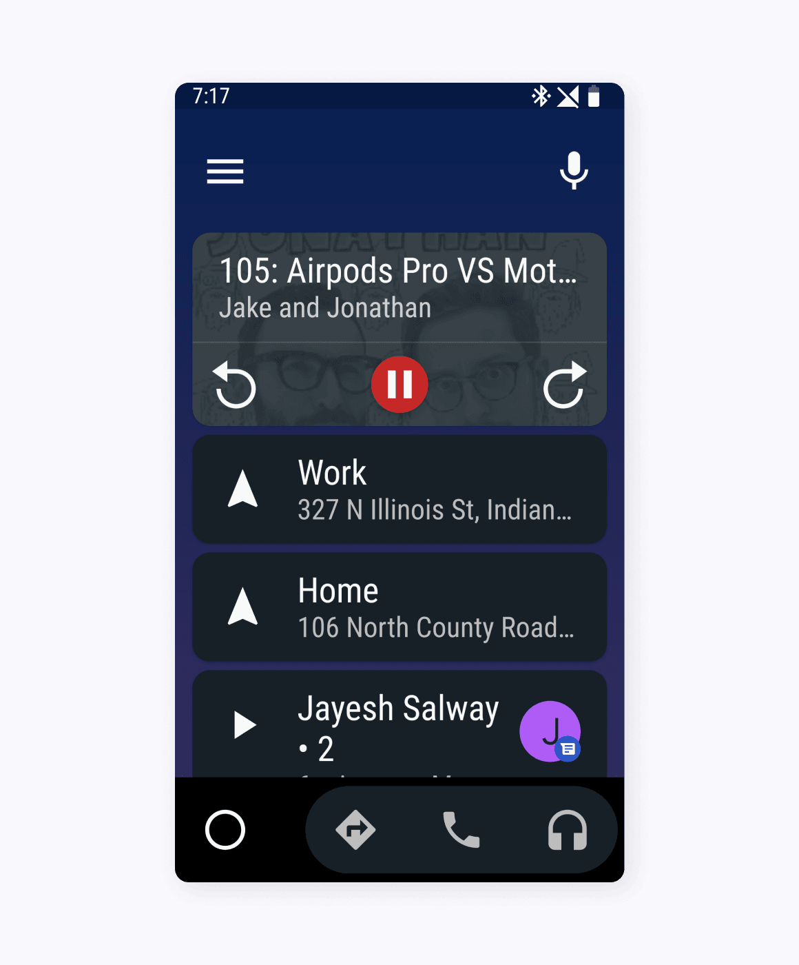
Home
The home screen completely re-thinks the purpose of the home screen and what a user needs to use it for. Auto uses this space to mixes notifications in with useful shortcuts to display recent calls and texts along with your next turn. The best part of all is that it activates do not disturb and removes all notifications for social media, email, and news to help you stay focused on the important task at hand.
App Drawer
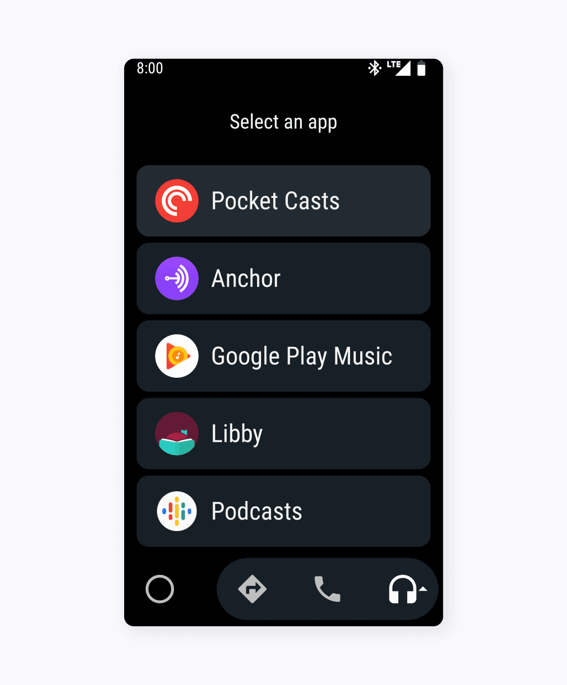
To reduce the number of taps required to start music or navigate to a new place, Android Auto allows you to set what your preferred app is for each navigation category. The first time you select a navigation category you are presented with a list of only apps that fit the selected category, like music, navigation, and calling.
When you select a preferred music app, Auto then provides a simple, but chunky audio control view. The only exception to this I found is that apps like Maps and Waze only adopt the chunkier bottom navigation and just squish the existing app interface in the space above. Not a bad solution, but sometimes this leads to stacked status bars, and much smaller display size then if you just opened the app on its own. I'm sure on smaller screens this could start to feel a worse choice than just using the nav app you prefer.
Audio Controls
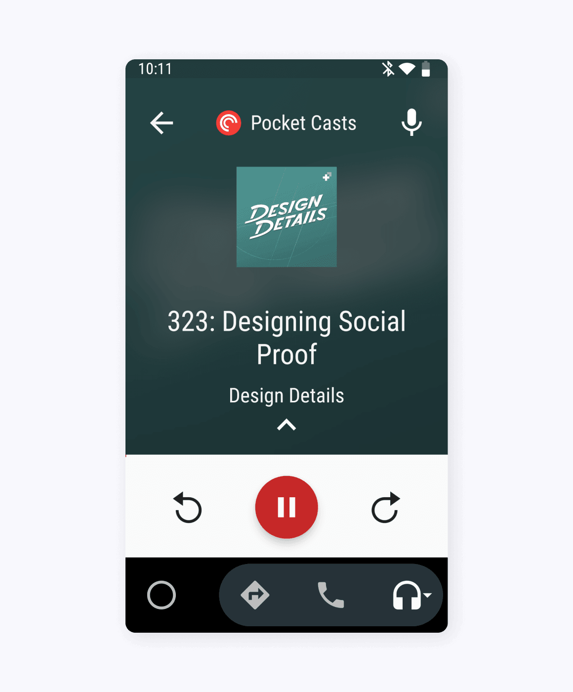
Auto also offers an entirely new, simpler interface that makes interacting with audio fast and simple. Fantastic apps like Pocket Casts can play audio within this new UI, meaning you can control the audio and view your playlist all within a simple menu. The goal appears to be simplicity, but thankfully, in this case, it doesn't mean removing important features that would keep you from enjoying your audio.
Android Auto truly feels like phone experience built from the ground up to be used at arm's length while driving down the road. Sadly, it seems like this app is not long for the world. Google announced that it is rolling out Assistant Driving Mode as a feature within the Google Assitant. That hasn't happened yet, and until it does I'm going to hold on to this excellent driving experience as it is still in the app store.